Globally trusted defense against cybercrime
Combining detection, threat intelligence and robust disruption & takedown, Netcraft’s automated digital risk protection platform keeps your organization and customers safe from phishing, scams, fraud and cyber attacks.

Defeating cyber attacks with unmatched scale and effectiveness
Netcraft’s online brand protection operates 24/7 to discover phishing, fraud, scams, and cyber attacks through extensive automation, AI, machine learning, and human insight. Our disruption & takedown service ensures that malicious content is blocked and removed quickly and efficiently—typically within hours.
0%
of the world’s phishing attacks taken down
0M+
threat reports and suspicious URLs analyzed every day
0M
cybercrime attacks blocked to date
0M+
attacks taken down and growing

A focus on innovation to keep up with ever-evolving cybercrime trends
Cybercriminals are constantly evolving—adapting new ways to attack your customers, employees, and your organization’s reputation. Effective brand protection requires extensive automation, constant innovation, experience, and expertise.
Our cutting-edge technology provides end-to-end cybercrime detection, threat intelligence, and disruption & takedown solutions backed by in-house expertise and decades of experience.
Netcraft’s cybercrime detection & disruption platform
From brand protection, uncovering a wide variety of potential cyber attacks and surfacing carefully validated threat intelligence to rapid response with industry-leading takedown speeds, Netcraft’s digital risk protection platform maximizes protection for your brand, organization, employees, and customers.

Cybercrime Detection
Netcraft’s automated detection operates around the clock to identify malicious websites as well as fraudulent domains, social media profiles, email campaigns and more.
Threat Intelligence
Our extensive automation and advanced machine learning techniques convert vast amounts of disparate data into actionable intelligence.
Disruption & Takedowns
Once confirmed, we block, disrupt and take down cyber attacks at scale. Access is quickly restricted for billions of people, and takedown notifications are sent within minutes.
The Netcraft difference
We are the world’s largest takedown provider, and centrally positioned in the global fight against cybercrime. Our detection, disruption, and takedown solutions are highly automated, powered by the vast amounts of data we collect every day and backed by the expertise of our in-house team.
Most importantly, we capitalize on our long-standing relationships within the infrastructure community to quickly mitigate the harmful impact of cyber attacks.
Resources & Insights
Blog
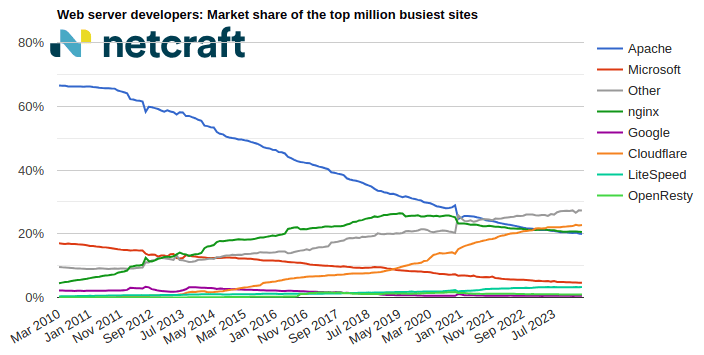
April 2024 Web Server Survey
In the April 2024 survey we received responses from 1,092,963,063 sites across 267,934,761 domains and 12,872,291 web-facing computers. This reflects … Read More
Learn More
Blog
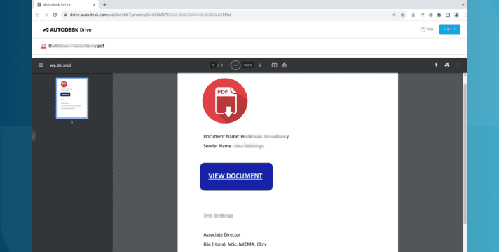
Autodesk hosting PDF files used in Microsoft phishing attacks
Autodesk is hosting malicious PDF files that lead phishing attack victims to have their Microsoft login credentials stolen. The elaborate … Read More
Learn More

Blog
The AI Gold Rush: ChatGPT and OpenAI targeted in AI-themed investment scams
Investment scams and AI – a match made in heaven? Online investment scams are a big money spinner for … Read More
Learn More
What’s that site running?
Discover the web technologies and internet infrastructure powering any site.
Discover more insights & tools
Report malicious sites to Netcraft, read the Netcraft blog, and explore more resources.
Customers we protect
As a well-respected industry leader, many of the largest brands and organizations around the world trust Netcraft. Our customer base includes a diverse mix of industries, sizes, and organizational types, including:

Schedule time with us
Learn more about Netcraft’s powerful brand protection, external threat intelligence and digital risk protection platform